Safari's default 'new tab' sucks so I built my own with Svelte and AirTable
My journey with mainstream web browsers has been interesting, to say the least. After using Chrome for many years, I decided to move to Firefox. Then Firefox Nightly. Then I made another move to Firefox Developer Edition, and I thought my journey was over. I had found the perfect browser.
Being a web developer sometimes means having 50 tabs opened simultaneously, and keeping another 50 you have to check eventually but not right now. I know there are many tab management add-ons out there, but I never found any that was particularly fit for my workflow. I was observing that over time and under a heavy load Firefox can have a hefty battery and memory management toll on my computer (similar to what happened to Chrome and made me leave it, albeit a little better) and it was time to try another browser.
I chose Safari. I know, now the most obvious choice for a web developer, but my idea was having a daily choice for browsing and still keeping Firefox Developer Edition and Chrome for testing and troubleshooting.
So what’s wrong with Safari?
Not much, really. It’s WebKit based, so most modern technologies are supported without a lot of trouble (I mean polyfills and fallbacks). It’s also important to know that Safari seems to focus a lot more on stability than performance, making it feel a little slower than Firefox or Chrome. But I really wanted to be able to keep my 80+ tabs open without having my battery drop 50% an hour and see my RAM usage in a constant spike.
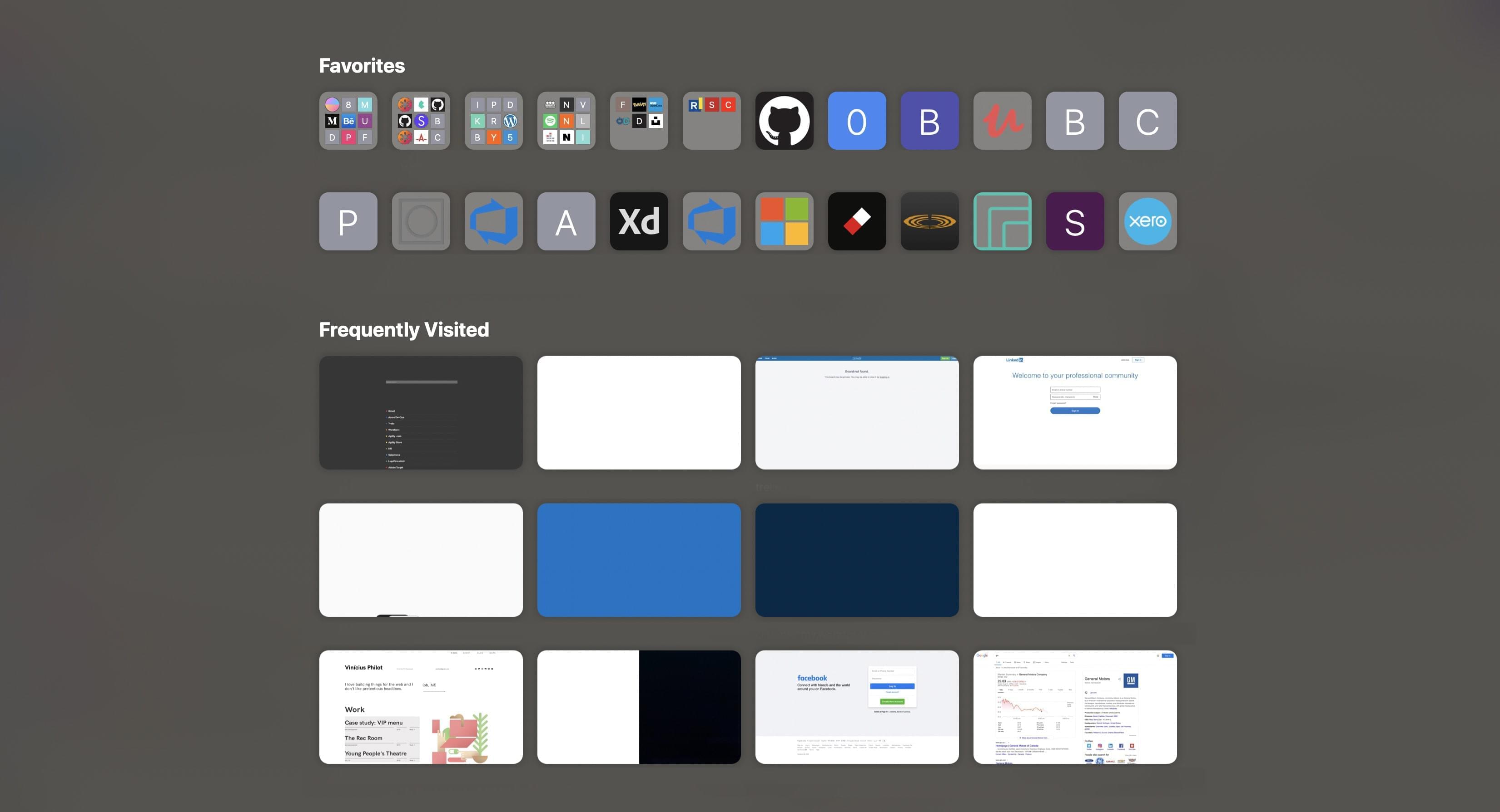
The most problematic feature of Safari in my opinion is the New Tab implementation. While Chrome and Firefox will let you move favourites around, pin new URLs, and delete the ones you don’t see fit, Safari has a very (very Apple-Esque) rigid implementation where you can either choose to see your Top Sites (the ones you visit most frequently), your Favourites (the ones you actively bookmarked), or both. It’s impossible to move them around, remove them, or pin your most used ones:
The stack and why Svelte?
Working with React and/or Vue on a daily basis, it’s very likely that you probably heard of Svelte
. As a JavaScript framework, it promises to eliminate abstraction layers we take for granted now (such as the Virtual DOM) to deliver highly performant web apps. It also has a very modest footprint compared to most mainstream frameworks. Since I never had a chance to use it before, I thought this small side project would be an interesting chance to experiment with it.To get started, I just replicated the starter project:
$ npx degit sveltejs/template new-tab
$ cd new-tab
$ npm i
Storing and retrieving data with Airtable
Comes AirTable
, an awesome spreadsheet-database hybrid that I believe is perfect for this use case. We want to be able to update entries on the cloud and have it reflected on the front end as quickly as possible. Setting up a whole back end for this would be just overkill. Airtable also exposes your data as an API out of the box. Creating your first document is just as simple as looking at a spreadsheet and start typing: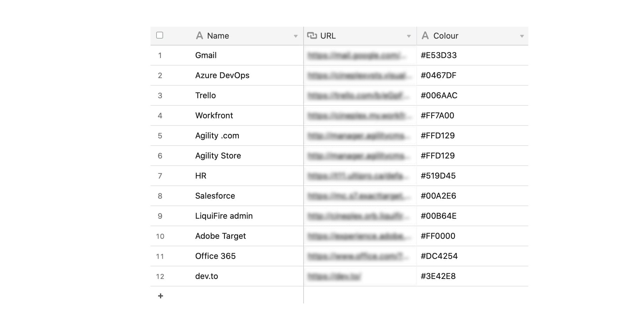
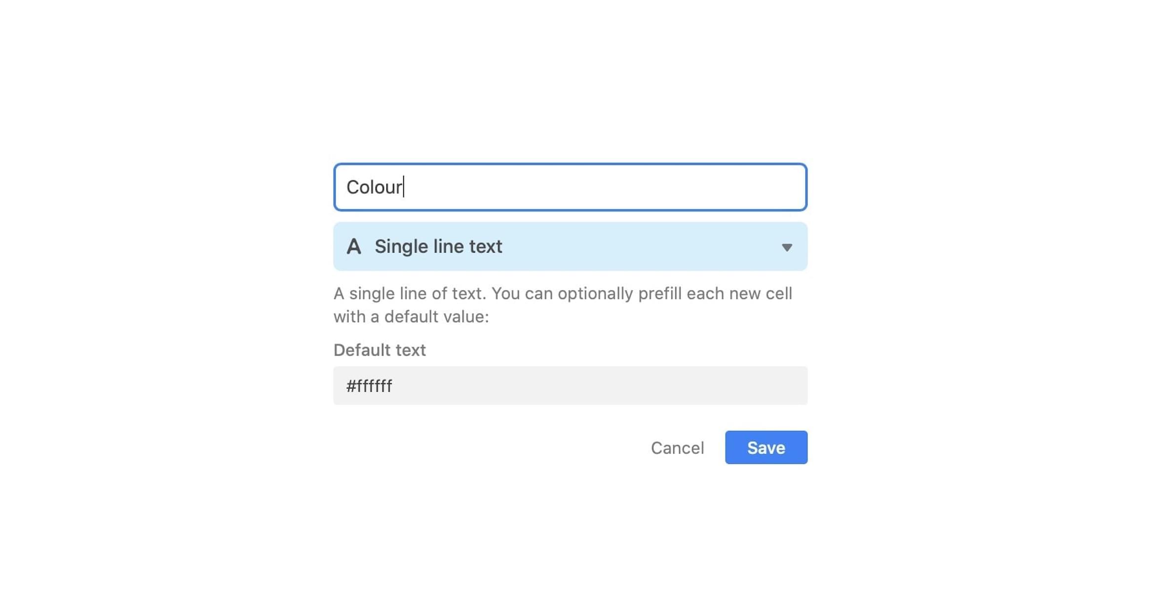
One interesting thing about the service is that it only exposes its more complex features as you need them. In this case, I wanted each entry to have a unique colour - so I specified a new entity type with a default value:
Retrieving this data is just as fetching the API with Svelte’s onMount hook inside App.svelte:
 let links = null

  onMount(async () => {
    await fetch(
      `https://api.airtable.com/v0/appbHvOKjQPdszt4L/new-tab?api_key=${process.env.AIRTABLE_API_KEY}&view=Grid%20view`
    )
      .then(response => response.json())
      .then(data => {
        links = data.records
      })
  })
And rendering the links list using Svelte’s template syntax (#):
<section class="links-section">
  {#if links}
    <div class="links-wrapper">
      {#each links as link}
        <div class="link">
          <i class="link-badge" style="background-color: {link.fields.Colour}" ></i>
            <button class="link-button" onclick="location.href='{link.fields.URL}'" type="button">
              {link.fields.Name}
            </button>
        </div>
      {/each}
    </div>
  {/if}
</section>
Google search and a few tweaks
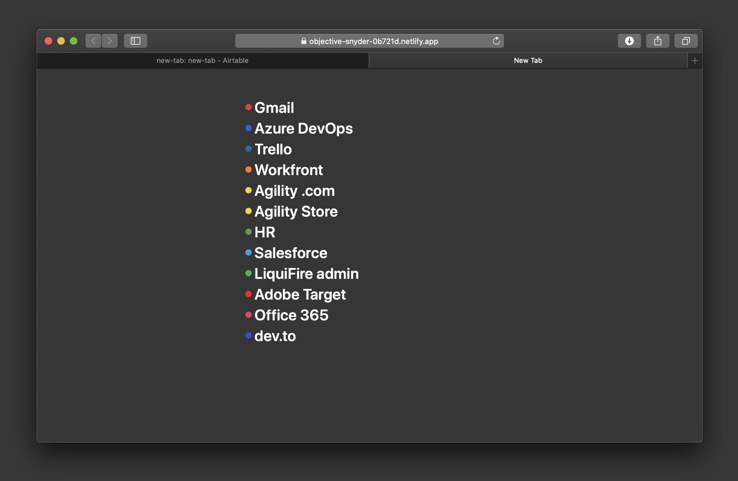
After having the an initial version setup, it was time to add a basic Google search module and tweak the styling a little bit:
<section class="search">
  <form on:submit|preventDefault={handleSubmit}>
    <input autofocus bind:value={searchValue} placeholder="Google Search">
  </form>
</section>
  const handleSubmit = () => {
	  location.href = `http://www.google.com/search?q=${searchValue}`;
  }
body {
  /* making sure the new tabs fonts are aligned with MacOS system fonts: */
  font-family: -apple-system, BlinkMacSystemFont, sans-serif;
}
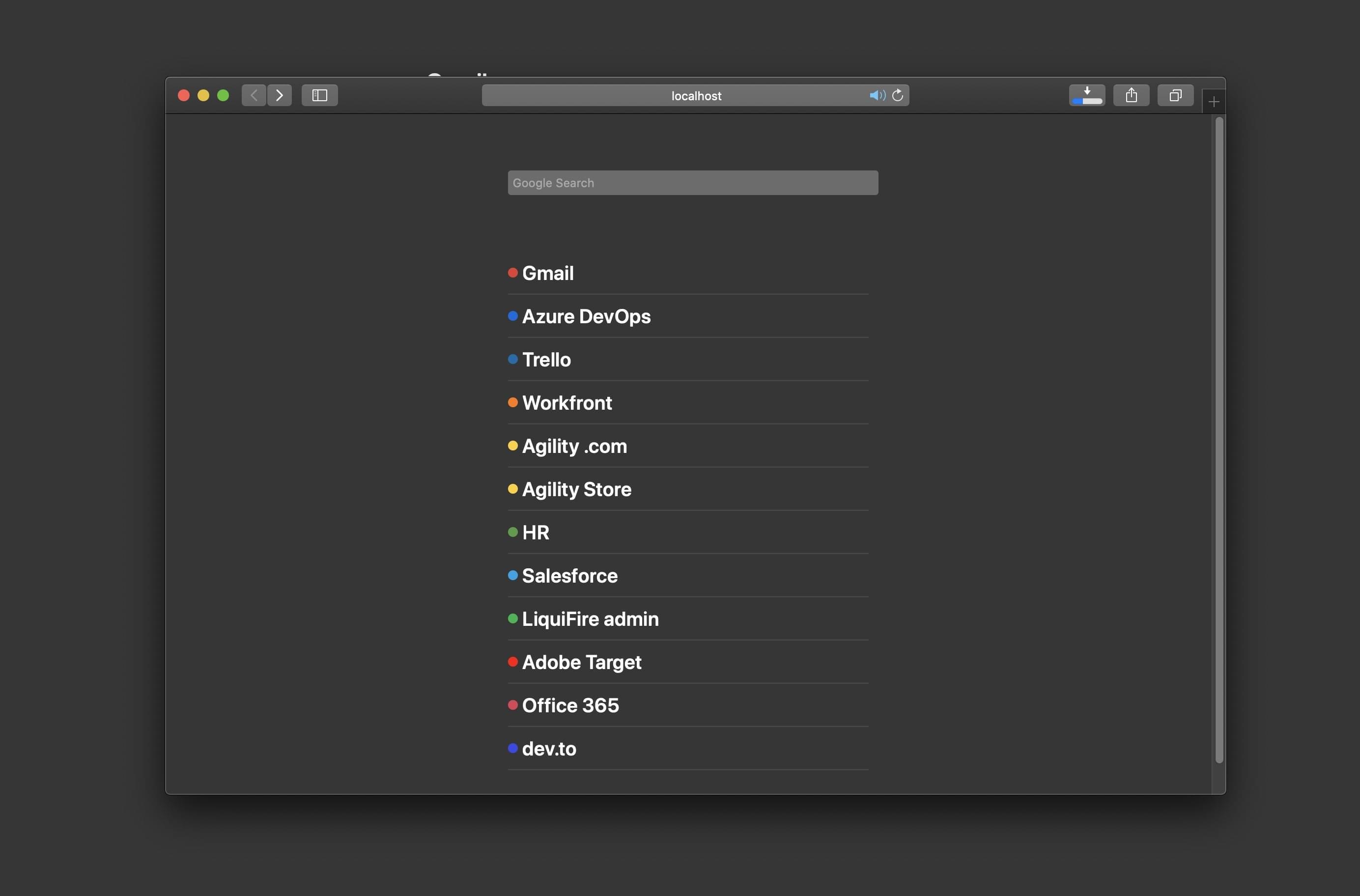
Deploying, performance, and wrap up
Deploying the app to Netlify
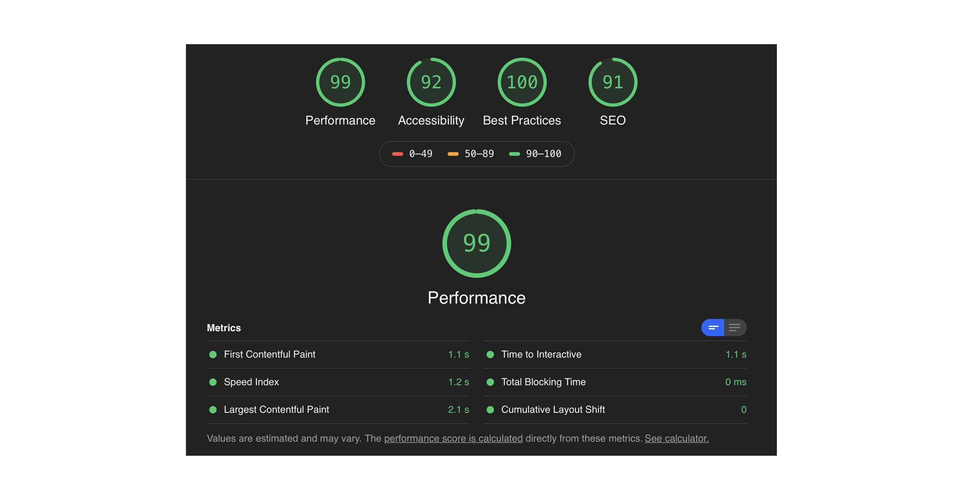
was just as simple as connecting the repo, setting the build command tonpm run build and setting the correct AIRTABLE_API_KEY environment variable (sites -> settings -> Environment -> Edit variables). Just by using simple semantic HTML and Svelte, the page got a 99 score on Lighthouse out of the box which, even given the simplicity, is pretty impressive:
After that, it was just a matter of setting my new tab on Safari to default to the deployed page. My first experience with Svelte was great - it’s extremely simple to use and behaves as you expect. I’m excited to try using it for more complex projects in the future.